
CoreLogic NZ’s latest ‘Mapping the Market’ (September 2019) report released delivers location analytics and geospatial expertise, useful in understanding the cost of a typical property in a suburb
The Mapping the Market Report looks at suburb median values, using current data and comparing it to the same time last year. It shows the median values in dollars, the % change from a year ago, and the $ change.
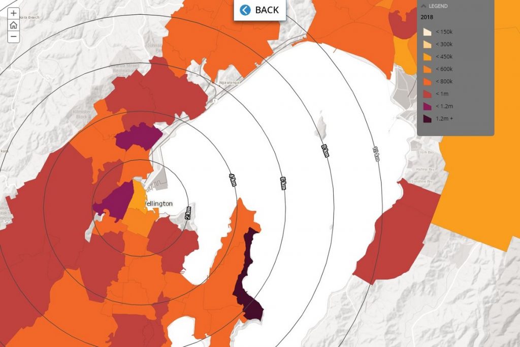
Its interactive format provides valuable insight into how the value of property varies across cities, across the country, as well as how values have shifted over time.
According to CoreLogic Property Economist, Kelvin Davidson, “The constantly changing dynamics of the New Zealand property market mean that many would-be homeowners often find it challenging to understand which suburbs currently match their home-buying budgets”.
This updated visualisation tool uses a geographic information system (GIS) – and millions of data-points in the background – to deliver an easy to interpret explanation of the current property market. By clicking on any particular NZ suburb readers can instantly see its current median property value.
With new attributes now added to the Mapping the Market tool, users can quickly see current median values, as well as values a year ago. In an upgrade from last quarter, CoreLogic has introduced each suburb’s change from a year ago in percentage and dollar terms, and it’s colour-blocked. Kelvin Davidson said “At a glance, it’s very easy to see which local suburbs sit within a particular budget.”
Some interesting snippets this quarter include:
• Spatial insight that a spreadsheet can’t always give you – e.g. Saint Johns in Auckland saw median values fall by 5% in the year to August 2019, but neighbouring Mount Wellington was stable.
• The coloured charts also easily allow users to see where there have been across-the-board rises in median values over the past year, e.g. Hamilton, Tauranga, and Wellington. However, again suburb differences emerge – Grandview Heights in Hamilton for example is up 6% over the past year, versus 1% in Western Heights.
• Dunedin has had very consistent % growth across its suburbs, but the $ value map reveals where this translates into the largest money increases – more than $60k in Maori Hill, North Dunedin, and Saint Clair.
Complementing the visual demonstration, the smart map also provides key market commentary from the CoreLogic research team, with data highlights and trends provided for each major city. However – users can easily focus in on any part of the country they want.


